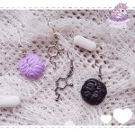
– they both have THE SAME FCKIN PRONOUNS SO I CONSTANTLY HAVE TO NAME BOTH CHARACTERS BECAUSE OTHERWISE IT’S IMPOSSIBLE TO TELL WHO’S DOING WHAT OR WHO’S SPEAKING WHO WILL SAVE ME FROM THIS HELL
I CAN’T BELIEVE THERE’S A POST ABOUT THIS. THE STRUGGLE IS REAL.
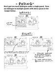
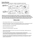
Worst way to deal with this: use epithets (the taller man, the blonde) DO NOT
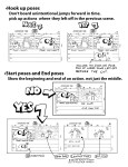
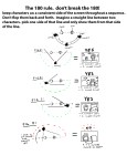
Best way to deal with this: Use the pronouns a teensy bit more than you maybe feel is sufficient. Leave the fic for two days before editing (i.e. allow yourself to forget it a little). Come back and re-read. If at any point YOU can’t tell who’s doing what to whom, put names in. Leave the rest of the pronouns.
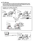
Also, for dialogue: use characterization instead of names. Let it be clear by the things that are said, the way they are said, who is saying them.
Readers are smart, let them infer sometimes. 🙂
So many people have asked me about this when writing same-sex relationships. I’ve been looking for this post for so long, I hope it helps, darlings!
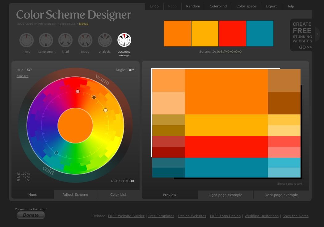
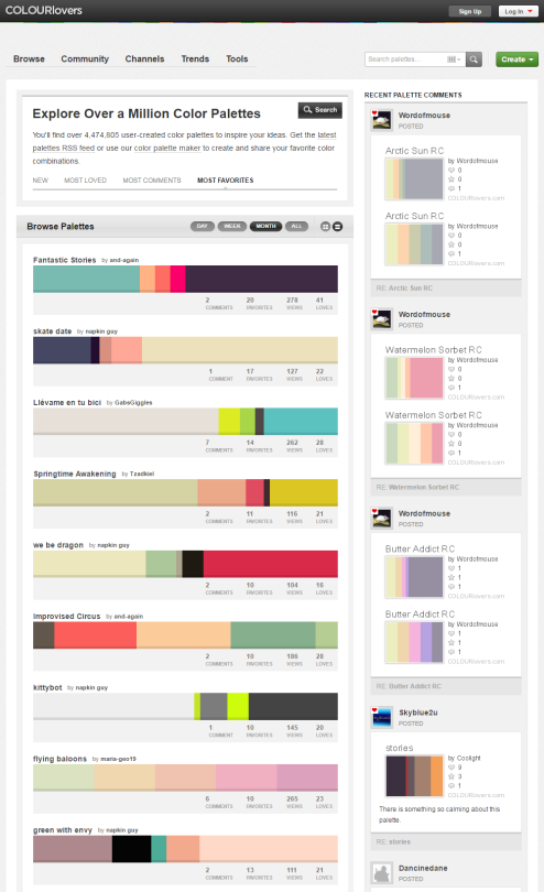
Hey look! It’s exactly what I was talking about during the stream!
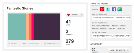
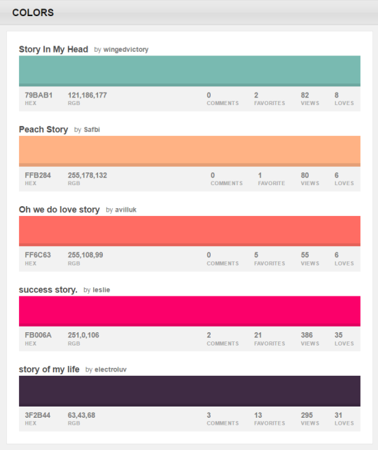
You can browse the most popular ones or search for certain colors, themes, and even specific hex codes!
When you find one you like, you can download a wallpaper swatch of it and also select the specific colors it uses to look at more palettes that use those same ones.
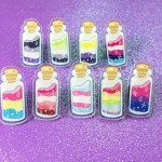
They’re finally here! A while back, I ran a kickstarter to fund these adorable pride sand art bottle acrylic pins. Now they’re here and available in my shop!! I’m so happy with how these turned out and I hope you’ll give ‘em a look! And to those who pledged to my kickstarter to make this happen– Thank you!!
This… this is the perfect setup for a lesbian harem manga, when those girls start comparing poems and realising that the styles suggest a single author.
Since I defs didn’t want to carve a real pumpkin to put on my head and get nasts pumpkin insides all over my hair I decided to paper mache one. Unfortunately there was no good tutorials anywhere so I will share my trial and error knowledge.
First I got some supplies: 1 Punch balloon (they’re rounder and larger they regular balloons), some paper mache stuff in a bag, cardboard, a glue gun, paint, sculpey clay, tape, some news paper and some water and flour mixed together.
I then put at least three – five paper mache layers of newspaper with flour water on the balloon. I also measured my head and left an opening at the bottom. (NOTE: Don’t put tape on the balloon and try to peel it off after you’re done paper macheing, RIP)
After that’s all dry I put glue gunned some cardboard onto it to give it some pumpkin like ridges.
Then I filled the gaps between the cardboard and the newspaper with the paper mache in a bag stuff. Wait for it to dry. (Note: Don’t pop balloon until the paper mache in a bag stuff is dry cause it holds a LOT of water and your paper mache project will sink, RIP) After that I popped the balloon and lightly dampened the top with a sponge and water until it was wet enough to slowly press down into more of a pumpkin shape.
After it’s all dry I taped a stem I made out of card board on the top and put another layer or two of newspaper mache over top.
More drying wait time (you can use your oven on the lowest setting to make it dry faster) then I sanded it down and cut out a face with an exacto blade.
I added a little bit of backing behind the face on the inside with the paper mache in a bag to give it more of a 3D look which wasn’t that noticeable but oh well, it kidna worked… After all that stuffs done I painted it all white otherwise the newsprint would bleed through and make my colours not as bright, I also added some sculpey clay to the brow area to give it some more emotion in which I used an iron to dry it with cause it was too late to put it in the oven with paint all over it (Note: Put clay on before painting).
I sprayed it with a sealer before painting colours on it cause I find acrylics do weird things sometimes. After it was all dry I begin to paint.
I also painted the inside a red and added a kinda head rest thing on the inside since when I pushed the top down it made an uncomfortable point at the top when putting it on your head. Then once it was all dry I sprayed it with some more sealer, added some cool stuff like stitches with some ribbon and blood which I used nail polish for a shiny effect and put in some lights which weren’t very effective when my head was in the pumpkin but that’s okay, it still looked cool.